Alergia_Grotesk
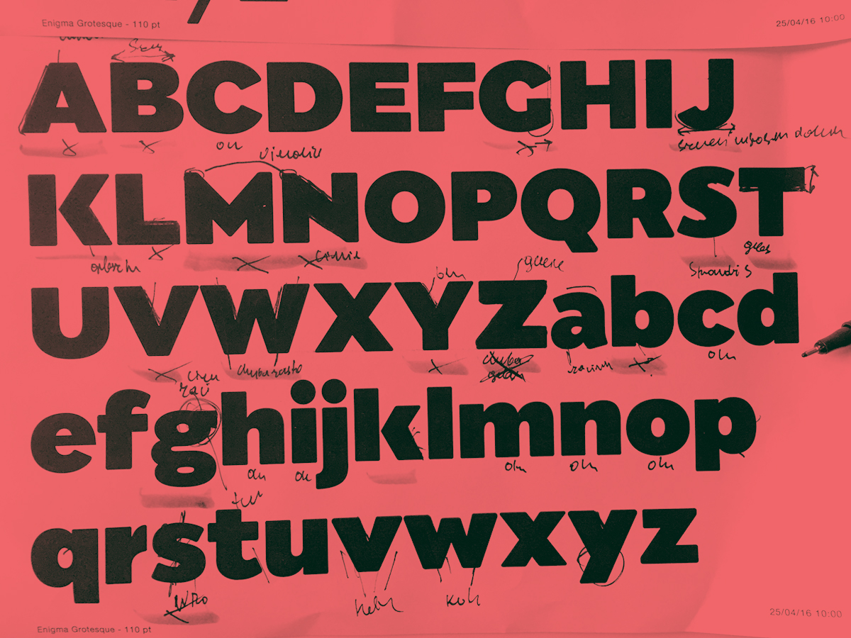
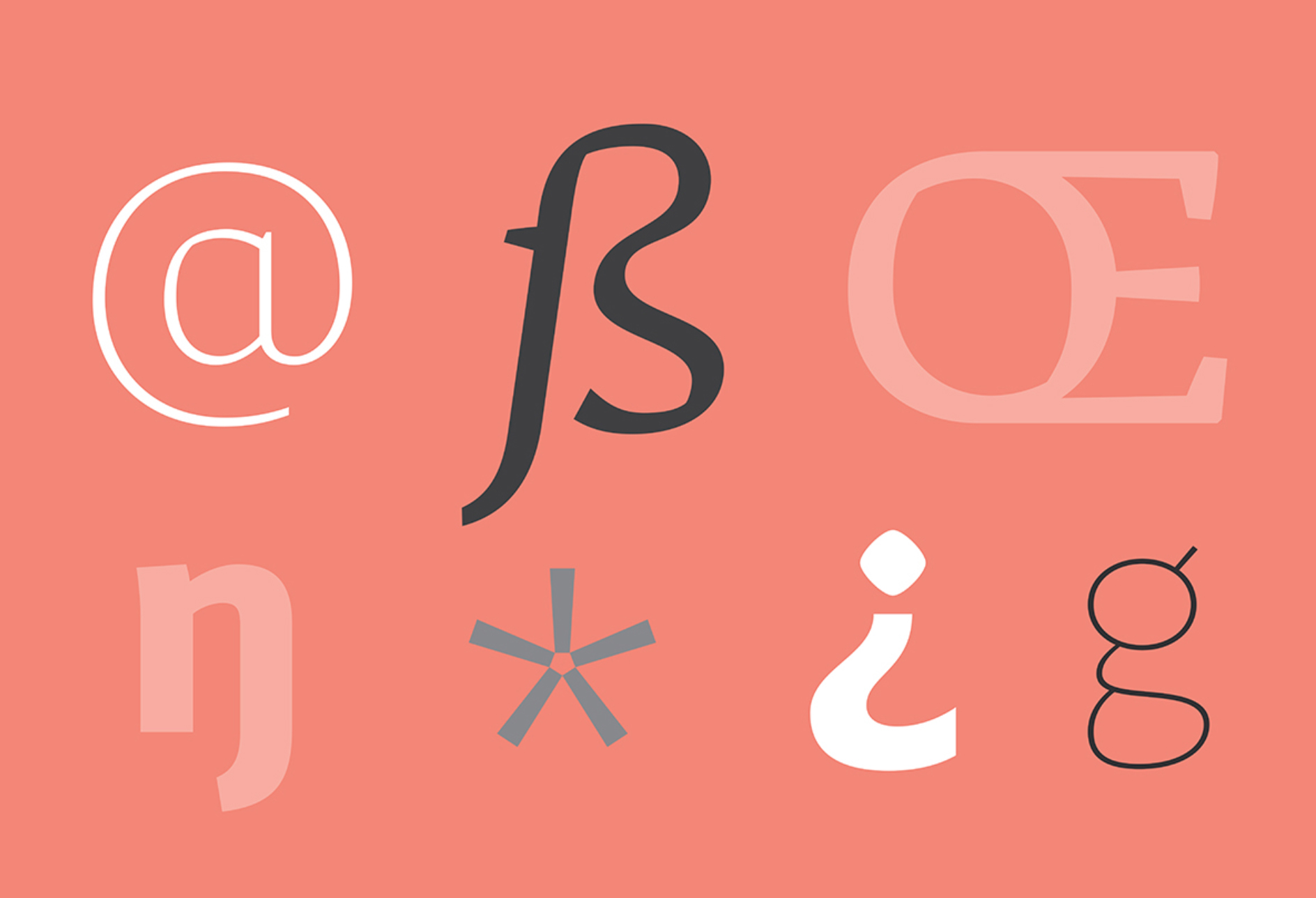
Alergia_Grotesk was made as a hybrid between a classical geometric grotesque and a linear antiqua. Typeface is characterised by a lot of details, which gives it a strong character. Unpredictable cuts in a letters “a” and “s”, or a double “g” in combination with a delicate contrast, makes Alergia_Grotesk a good choice for many purposes from headlines to short flowing texts. A big range of width varieties allows to versatile use and can give a nice effect while mixing extreme varieties with each other in one project. Family consist 10 weights, 3 widths and set of italics – together 60 styles. The whole family has a comprehensive set of characters. In additionton the Latin letters, Alergia_Grotesk also has a full set of characters for Vietnamese, extended Cyrillic (with Abkhasian) and Greek.
4 Styles (Regular, Italic, Bold, Bold italic) are completely free! Download it


Ur. 1989; studia na Wydziale Grafiki ASP w Warszawie (2009–2014). Obecnie na 2 roku studiów doktoranckich. Kilkukrotny Stypendysta Ministra Kultury. Zajmuje się projektowaniem graficznym z naciskiem na identyfikację wizualną oraz projektowanie krojów pism. Autor projektu rodziny 42 odmian krojów pism dla korporacji Tupperware na zlecenie RR Donnelley Europe oraz identyfikacji wizualnej gali Nagrody Solidarności im. Lecha Wałęsy. Dyrektor artystyczny magazynu „Warsawholic”.